Dunkin' Free Donut Friday: keeping a giveaway from looking cheap
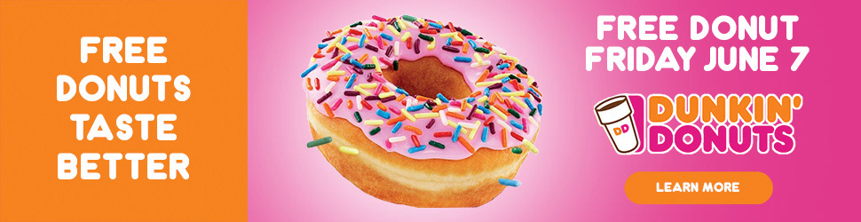
Free-item promotions in QSR have a tone problem. The offer is generous. The creative usually looks discount. The brand spends 12 months building equity and a banner ad spends 6 seconds borrowing against it.
The Dunkin' "Free Donut Friday" units I designed kept the offer hero but treated the donut like product photography. The brand's strawberry sprinkle gets shot tight, lit clean, no clip-art halo. Type stays playful but the layout reads premium.
The work is letting the offer be the loudest thing without letting it be the cheapest-looking thing.
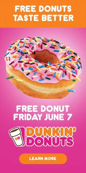
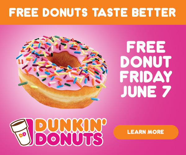